


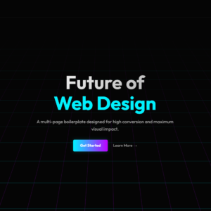
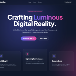
Lumina represents the cutting edge of modern 2024/2025 web aesthetics, moving away from flat, static designs to deep, fluid, and animated environments. This template is architected to serve as a complete website foundation, featuring a fixed navigation bar that seamlessly routes between the Home, About, and Contact views.
Key Technical Implementations:
1. Ambient “Aurora” Backgrounds
-
Technique: Pure CSS Keyframe Animations.
-
Implementation: We avoided heavy video backgrounds or JavaScript libraries. Instead, we used two absolute
divelements (.blob-1and.blob-2) with high-contrast radial gradients. By applying a massivefilter: blur(80px)and distinct@keyframesanimations (move1andmove2), the blobs drift organically across the viewport, creating a fluid “lava lamp” or “northern lights” effect that performs smoothly on all devices.
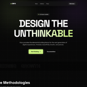
2. Advanced Glassmorphism
-
Technique: Backdrop Filters and Alpha Transparency.
-
Implementation: A custom
.glassutility class was created to applybackdrop-filter: blur(16px)combined with a highly transparent white background (rgba(255, 255, 255, 0.03)). This is used on the navigation bar, feature cards, and badges to allow the animated background colors to bleed through the UI, creating a sense of physical depth.
3. Multi-Page Navigation Structure
-
Technique: Semantic HTML5 Linking.
-
Implementation: The navigation bar is structurally prepared for a multi-page experience. It includes configured
<a>tags pointing toindex.html,about.html, andcontact.html. The layout uses a fixed positioning strategy (fixed w-full z-50) to ensure the menu remains accessible regardless of scroll depth on any of the linked pages.
4. Typography & Color Variables
-
Technique: Google Fonts & Tailwind Config Extension.
-
Implementation:
-
Font: We utilized Plus Jakarta Sans, a geometric sans-serif that offers high legibility in dark mode.
-
Theme: The Tailwind config was extended to include semantic color names like
accent(Indigo) andaccentSecondary(Pink). This allows for gradient text effects (bg-gradient-to-r) on the main headline to tie the typography visually to the background blobs.
-
5. Grid Layouts & Hover Physics
-
Technique: CSS Grid and Transform transitions.
-
Implementation: The feature section uses a 3-column grid. To break the visual monotony, the middle card has a negative margin on desktop (
md:-mt-8), creating a staggered, masonry-like appearance. Hover states usegroup-hoverto slightly scale icons and brighten borders, providing tactile feedback to the user.
Reviews
There are no reviews yet.