


This project demonstrates a high-conversion “Clean Corporate” design architecture. Unlike experimental or dark-mode sites, this codebase prioritizes legibility, trust, and structural hierarchy using a refined “Slate” and “Brand Blue” color palette defined in the Tailwind configuration.
Key Technical Implementations:
1. Glassmorphism Navigation
-
Technique: usage of
backdrop-blur-mdand semi-transparent white backgrounds (bg-white/80). -
Implementation: The
<nav>element is fixed to the top (fixed w-full z-50). The blur effect ensures the menu remains readable while allowing the hero section and page content to scroll visually “behind” the header, maintaining context without obstructing the view.
2. Gradient Text & Lighting Effects
-
Technique: Webkit background clipping and CSS filters.
-
Implementation:
-
Headline: The phrase “Intelligent Tools” uses a custom
.text-gradientclass which applies a linear gradient (from-blue-400 to-purple-500) and clips the background to the text itself (-webkit-background-clip: text). -
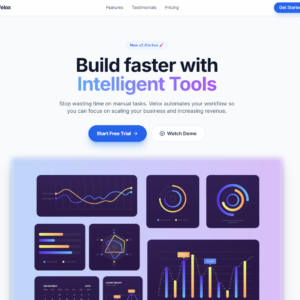
Atmosphere: A subtle glow effect behind the dashboard image is created using an absolute div with a gradient background, high blur radius, and low opacity (
blur opacity-30).
-
3. Interactive “Group” States
-
Technique: Tailwind’s
groupandgroup-hovermodifiers. -
Implementation: In the Features section, the cards are assigned the
groupclass. When a user hovers anywhere on the card, specific child elements (like the icon container) trigger their own animations (changing background color from light blue to solid blue, and the icon text from blue to white). This creates a cohesive, tactile feel for the whole component.
4. Responsive Grid Architecture
-
Technique: CSS Grid with media query breakpoints.
-
Implementation: The layout creates a mobile-first experience that stacks vertically (
grid-cols-1) and expands to a three-column layout (md:grid-cols-3) on tablet and desktop screens. This is applied consistently across the Features, Testimonials, and Pricing sections for visual rhythm.
5. Hierarchy via Depth (Shadows & Borders)
-
Technique: Layered shadows and varying border opacities.
-
Implementation:
-
Pricing: The “Professional” plan is visually emphasized not just by size, but by a distinct border (
border-brand-600) and a heavy shadow (shadow-2xl shadow-brand-200), making it “pop” off the screen compared to the flat sibling cards. -
Buttons: Primary action buttons use colored shadows (
shadow-brand-500/30) to create a “glowing” effect that suggests interactivity.
-
Reviews
There are no reviews yet.